STEM Spotlight
16th July 2020
It’s no secret that STEM titles are an important feature in all non-fiction publishing lists, and we like to say we are pro’s at them here at Collaborate…. but when it comes to reluctant readers, what can we do to get them interested? Here we break down our tried and tested ‘soft learning’ techniques to get those pages turning…
- First of all, it’s very important to take the editorial approach into account when thinking about your subject and audience. Most children these days live in a world of constant distractions, so you have to work hard to hold their attention! Plain English and short, direct sentences will prevent the mind from wandering, and including expressive sentences can draw intrigue. For example ‘So come on, let’s explore the extraordinary world of Quantum Physics!’ builds excitement around a topic that a reluctant learner might have otherwise felt bored by. By using words like ‘let’s’, ‘we’ and ‘you’ the reader feels involved and is less likely to assume ‘this subject just isn’t for me’.
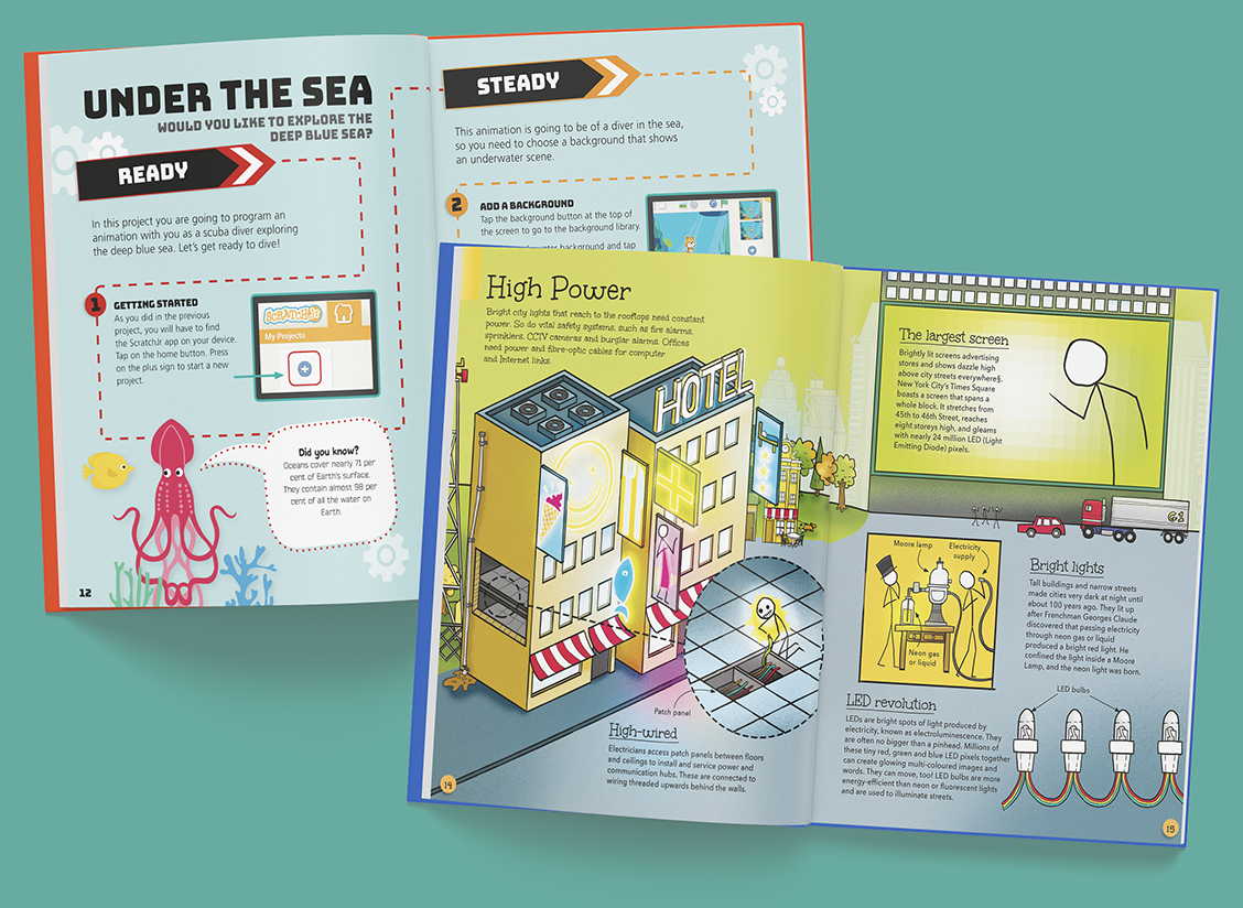
- Dynamic page compositions are what help to give our books the ‘wow factor’, but we also pay close attention to the navigation of the page, taking a step-by-step approach that communicates clearly to the reader and makes complex topics easier to follow.
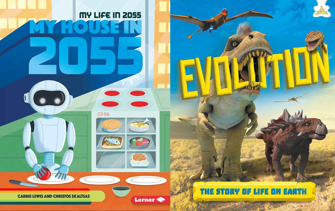
- Let the pictures do the talking. Most children (and many adults) are visual learners, and a great illustration style is likely to be what gets your book picked up in the first place. While a colourless spread of solid text describing ancient battle techniques is likely to send your reader to sleep, a full page illustration of a Viking berserker charging into battle will grab their attention and get them excited to learn all about the image in front of them!
- Consistency is key to engaging a reluctant reader, and for this the author and designer need to work together on planning a format. The amount of subheads per page should not vary by more than one or two and should be clearly signposted throughout. Incorporating lists, ‘fun facts’ or callouts will add points of interest to keep the mind engaged, but it’s important that these are repeated throughout the book. This keeps the design consistent and helps the reader to grow in confidence as they see their work progress.
- Keep accessibility a factor. Bear in mind that certain colour clashes may be difficult for colour-blind readers to see. Font choices are, of course, incredibly important to the look, feel and readability of the text and in selecting them you need to balance form and function. The much-loathed comic sans font is actually one of the easiest fonts for dyslexic people to read, but you are unlikely to see any self respecting design studio using it, even in a reading book for children. A recent study by Pompeu Fabra University* discovered that sans serif, roman and monospaced fonts are easiest for dyslexic viewers to read, whilst italics will slow down reading time. This is a great thing to keep in mind when considering your audience.
- Page count. It’s best to keep your book under 32 pages so that it doesn’t feel overwhelming. If a book looks thick and heavy, a reluctant reader simply isn’t going to want to pick it up.
- Incorporate activities throughout the book, whether this is a simple trivia on each page, a complex quiz on the central spread, or dynamic drawing activities. An interactive approach to learning is far more likely to get your reader engaged with their subject matter. More importantly, it’s fun!
* http://dyslexiahelp.umich.edu/sites/default/files/good_fonts_for_dyslexia_study.pdf